Data Card Layout
Last Updated:
Data Cards give you a Notion-like view of your lists, showing item properties right on the card so you can see and edit information at a glance.
Enabling Data Cards
- Open a list
- Tap ••• in the top right
- Tap “Edit List Details”
- Under Layout, choose “Large Data Card” or “Medium Data Card”
Large Data Card — One column on iPhone, two on iPad. Best for lists with several properties to display.
Medium Data Card — Two columns on iPhone, four on iPad. More compact while still showing property details.
What Appears on a Card
Each Data Card shows:
- Cover image (with optional “Cover” or “Fit” image mode)
- Item title
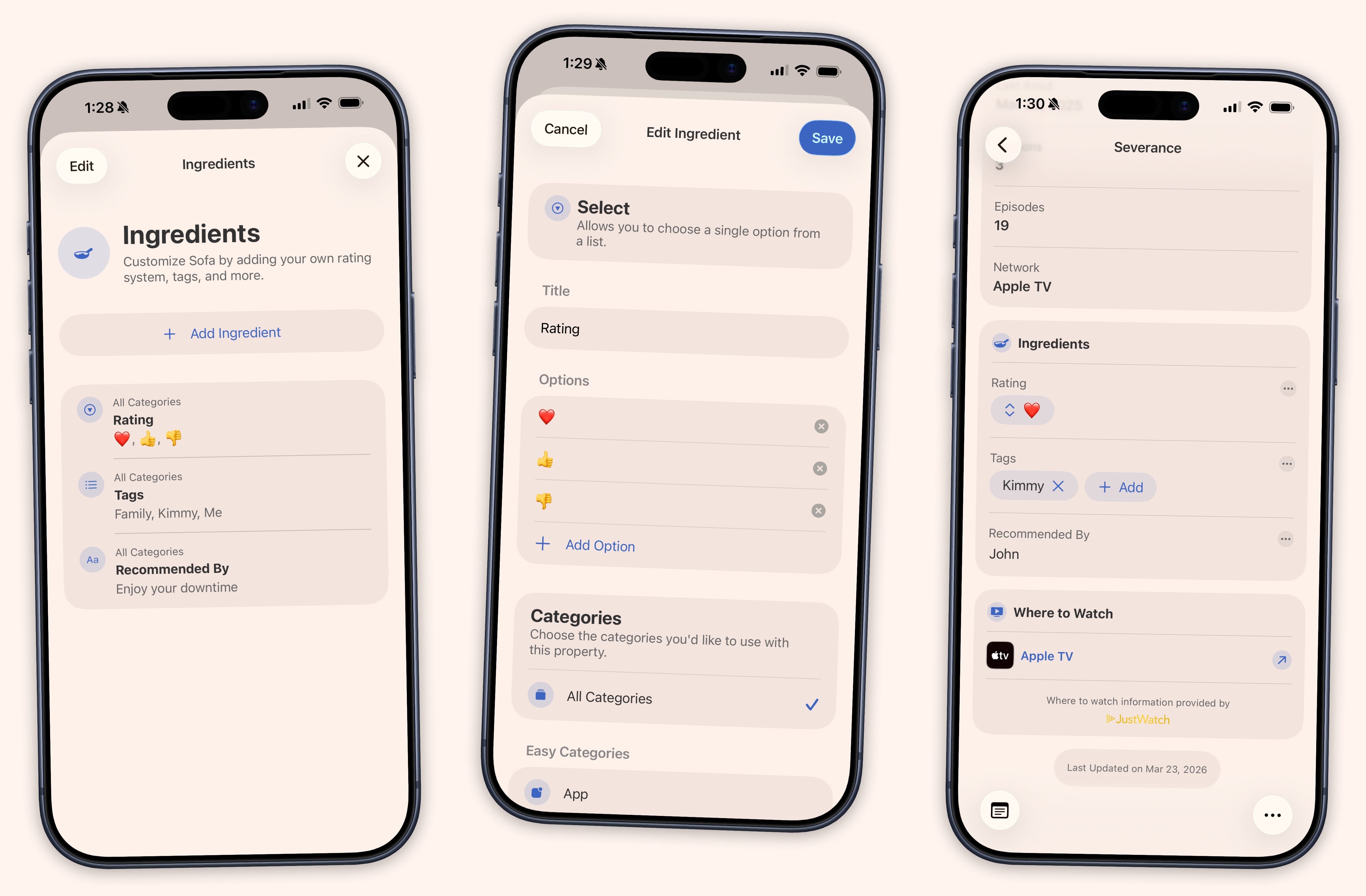
- Configurable property rows — ratings, tags, genres, streaming services, custom Ingredients, and more
Cards automatically adjust their height based on how many properties are shown.
Tap-to-Edit
The best part of Data Cards is tap-to-edit. Tap any property row directly on the card to edit it without opening the full item detail view. A focused editor appears with the right input type for each field:
- Text — Keyboard input
- Number — Stepper control
- Date — Date picker
- Checkbox — Toggle
- Select / Multi-Select — Option picker
- Link — URL input
Changes save instantly.
Image Mode
Data Cards offer two image modes:
- Cover — Fixed 4:3 crop, consistent card heights
- Fit — Adapts to the image’s natural aspect ratio, so tall movie posters and wide album art display properly